Every January a fresh batch of “web design trends” makes the rounds — some genuinely useful, most destined to date your site within a year. The trick isn’t chasing them. It’s knowing which ideas are fashion and which are fundamentals that quietly compound. Here are five that have outlasted the hype and still earn their place on every site we build.
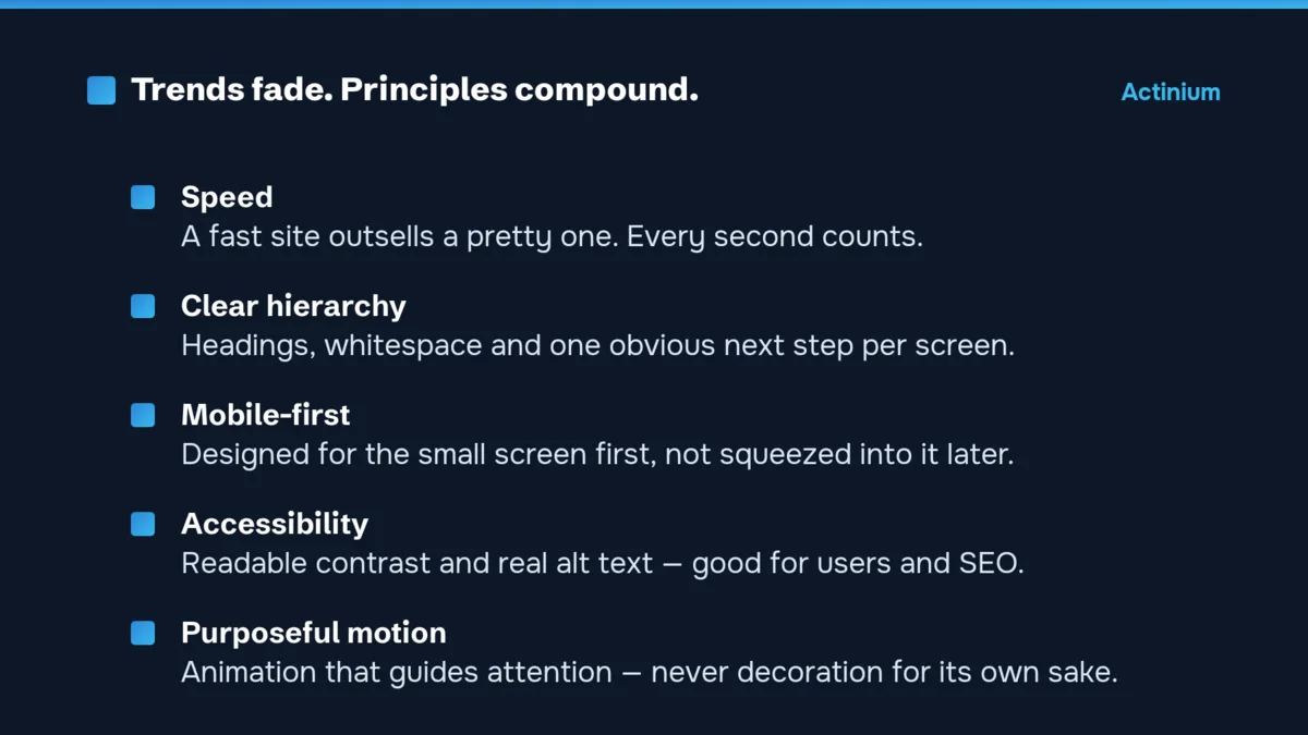
1. Speed as a design decision
The fastest-loading version of a page almost always converts better than the prettiest one. Speed isn’t a developer afterthought — it’s a design constraint that shapes every choice: image weight, how much script you load, whether that hero video is worth the wait. Treat performance as part of the look and feel, not a box ticked at the end.
2. Clear visual hierarchy
Big, confident headings, generous whitespace and one obvious next step per screen. This was a “trend” a decade ago and it’s simply good design now. When a visitor lands, their eye should go straight to what matters — not get lost in a wall of equal-weight content. Whitespace isn’t empty; it’s what makes the important things stand out.
3. Mobile-first, genuinely
Most of your visitors are on a phone, so the small screen isn’t the afterthought — it’s the starting point. Designing mobile-first means the layout, tap targets and reading flow are built for a thumb from the beginning, then expanded for desktop. The reverse — squeezing a desktop design down — is where the broken, frustrating mobile experiences come from.
4. Accessibility and readable contrast
Readable text, sensible colour contrast and real alt text used to be treated as optional polish. They’re not. They make your site usable for more people, they’re increasingly a legal expectation, and search engines reward the same structure that screen readers rely on. Accessible design is just better design — for everyone, and for SEO.
5. Motion with a purpose
Subtle animation can guide attention, show what’s clickable and make a site feel alive. Motion for its own sake — elements flying in from every direction — just slows the page and gets in the way. The trend worth keeping is restraint: animate to help the user understand the page, never to show off.
The throughline
None of these are flashy, and that’s the point. Trends fade; principles compound. We build sites as products — grounded in fundamentals that age well, then refined with real data after launch — the basis of our web design and development. You can see the approach across our recent work, or have us check your current site against these basics with a free 48-hour audit.